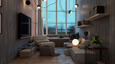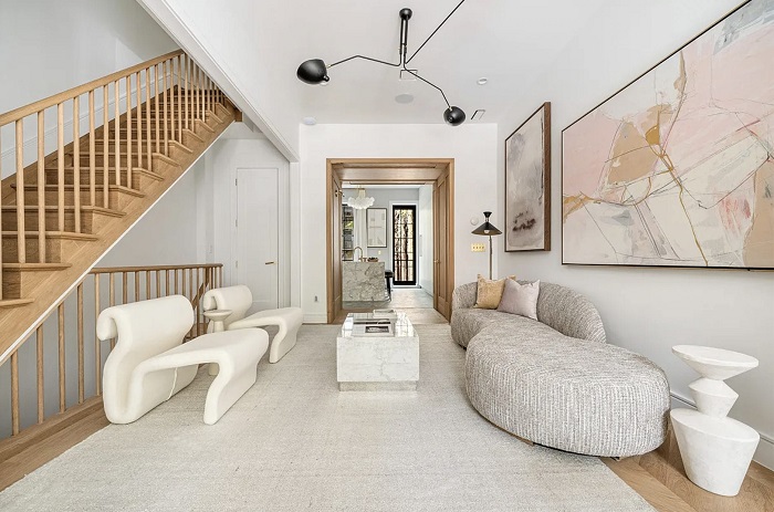
Most people notice paint color first when entering a room. They admire a soft sage green, an understated charcoal, or a warm alabaster white. Yet, when a room feels inexplicably flat, cold, or sterile despite an enviable color palette, the culprit is rarely the pigment on the drywall. The missing ingredient is almost always a lack of textural dimension and pattern hierarchy.
Color dictates the mood of a space, but textures and patterns give it life, depth, and tangible substance. Without them, a room remains two-dimensional, like a glossy catalog photo that looks appealing at a glance but fails to hold interest over time. By thoughtfully layering tactile surfaces and dynamic prints, you shift a space from a purely visual environment into an immersive, sensory home that invites touch, curiosity, and relaxation.
The Dual Nature of Texture: Tactile Versus Visual
Texture in interior design operates on two distinct planes: physical feel and optical illusion. Mastering both is essential for cultivating visual interest without cluttering a floor plan.
Tactile texture refers to the actual physical sensation of a surface beneath your fingers. It is the nubby grain of a bouclé armchair, the cool, silken polish of honed Carrara marble, the rough ridge of an exposed brick fireplace, or the crisp weave of Belgian linen drapery. When you enter a room, your mind instinctively anticipates how these materials will feel to the touch, creating an immediate emotional response.
Visual texture, on the other hand, is an optical impression of depth. A smooth porcelain tile printed to mimic weathered slate, a printed grasscloth wallpaper, or the natural variations running through a slab of rift-sawn white oak provide visual texture without necessarily feeling rough.
Both varieties influence what designers call visual weight. Heavy textures, such as rough stone, thick cable knits, and distressed timber, absorb light, cast subtle micro-shadows, and anchor a room with a sense of stability. Smooth, reflective textures—like polished brass, mirrored glass, and lacquer—bounce light across the room, feeling light, clean, and modern. A room dominated exclusively by smooth surfaces feels clinical and slippery, while a room stuffed with only rough, heavy textiles feels dark and suffocating. The magic happens in the tension between the two.
The Art of Layering Textures Without Visual Chaos
Creating a textured room does not mean piling every available fabric and finish into a single corner. Successful rooms rely on deliberate contrast, pairing opposites to highlight the distinctive qualities of each material.
To build a balanced tactile landscape, adopt the principle of material tension:
-
Pair hard, unforgiving architectural surfaces with soft, forgiving textiles, such as a cast concrete coffee table set atop a high-pile Moroccan wool rug.
-
Balance dense, matte fabrics with reflective, luminous accents. A deep velvet sofa gains energy when framed by a slender, brushed-brass floor lamp and flanked by a low-luster ceramic side table.
-
Contrast fine, delicate weaves against coarse, organic surfaces. Crisp cotton percale sheets feel far more luxurious when backed by an upholstered headboard in coarse slub linen or finished with a chunky waffle-knit blanket.
When you bring together materials that sit at different points on the spectrum of sheen and roughness, you create rhythmic contrast. Each piece defines its neighbor: the sleek tabletop accentuates the coarse weave of the nearby drapery, while the soft upholstery tempers the hard edges of structural millwork.
Mastering Pattern: Scale, Rhythm, and Movement
While texture works through physical and optical depth, pattern introduces movement. Patterns create an intentional path for the human eye to travel, preventing the gaze from stalling in one spot. When handled correctly, patterns infuse personality, reinforce an architectural theme, and make expansive rooms feel intimate or small rooms feel expansive.
The primary obstacle homeowners encounter when working with pattern is fear of visual clutter. The secret to mixing patterns lies in managing scale and balancing geometric structures against organic motifs.
The Rule of Varied Scale
The most reliable framework for combining patterns is the three-scale rule. Select three distinct patterns, each operating at a noticeably different size:
-
The anchor pattern: A large-scale print that makes a definitive statement, such as a sweeping botanical wallpaper, an oversized buffalo check, or an expressive scenic toile. This piece anchors the room and establishes the primary narrative.
-
The supporting pattern: A medium-scale print roughly half the size of your anchor. If your large pattern is floral, your medium pattern might be a tailored stripe or a classic houndstooth on a pair of accent chairs.
-
The accent pattern: A small-scale, tight motif, such as a micro-geometric print, a subtle ticking stripe, or an intricate ditsy floral on a lumbar pillow. From across the room, small-scale patterns read almost as a solid visual texture, only revealing their complex geometry upon closer inspection.
Varying the scale prevents the patterns from competing against one another. If you place three medium-sized prints together, your eyes dart anxiously between them, unable to determine where to rest.
Balancing Geometric Precision with Organic Flow
In addition to varying scale, pay attention to the nature of the lines. Rigid geometric patterns—stripes, checks, grids, and herringbone—convey order, discipline, and architectural clarity. Organic patterns—botanicals, damasks, ikats, and flowing marbled motifs—evoke warmth, ease, and nature.
Pairing a crisp, linear ticking stripe with a loose, curving watercolor floral creates an instinctive visual harmony. The straight lines provide the necessary structure, while the organic curves prevent the room from feeling stiff or clinical.
Creating Cohesion Through a Unifying Color Thread
A room can comfortably support four or five distinct patterns and a half-dozen contrasting textures as long as they share a unifying color story.
Choose a baseline palette of two or three core colors and ensure that every pattern you introduce includes at least one of those shared hues. For example, if your large-scale floral drapery incorporates navy, terracotta, and soft ivory, a secondary striped pillow in navy and cream will blend naturally, as will a small terracotta geometric throw. The shared pigment acts as an invisible bridge that ties seemingly unrelated aesthetics into a coherent, intentional whole.
Controlling contrast is equally vital. High-contrast patterns—such as a stark black-and-white cabana stripe—demand immediate attention and work best as isolated focal points. Low-contrast patterns, where the print colors sit close to one another in value, provide quiet elegance, adding character to walls and upholstery without dominating the room.
Practical Strategies for Everyday Living Spaces
Applying these concepts across different rooms requires adapting your approach to how each space functions:
-
The living room: Ground the conversation area with a textured rug—such as a braided jute base layered with a soft vintage runner. Dress a smooth leather couch with nubby wool cushions and an open-weave linen throw. Introduce pattern through accent seating, roman shades, or framed abstract art prints.
-
The bedroom: Focus heavily on tactile comfort around the bed. Layer a crisp sateen duvet cover against a raw silk quilt, topped with patterned decorative shams that introduce a subtle botanical or geometric note. Consider a grasscloth wallcovering behind the headboard to add warmth and dampen ambient sound.
-
The kitchen and bath: These utilitarian rooms often suffer from an overdose of slick, non-porous surfaces. Introduce warmth through handmade zellige tiles that carry subtle surface irregularities, reeded oak vanity fronts, unlacquered brass hardware that develops a natural patina, and patterned runner rugs that soften cold tile floors.
Designing an enduring home is not about chasing transient aesthetic trends or copying a showroom floor plan. It is about crafting an environment that feels lived-in, grounded, and rich with dimension. By weaving together contrasting tactile textures and a disciplined hierarchy of patterns, you transform any interior from a flat, forgettable box into an engaging, multi-layered sanctuary.